How to Read a Stock Chart
Stock charts are the language of the financial markets. Understanding how to read one helps you make more informed investment decisions. Here's a beginner-friendly guide to the basics.
The Price Chart
The most basic stock chart shows price on the vertical axis and time on the horizontal axis. You can view charts across different timeframes — one day, one month, one year, or more.
Line Charts
A single line connects closing prices over time. Clean and easy to read, but hides intraday movement.
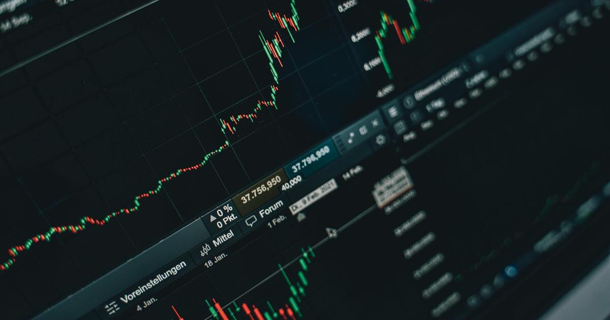
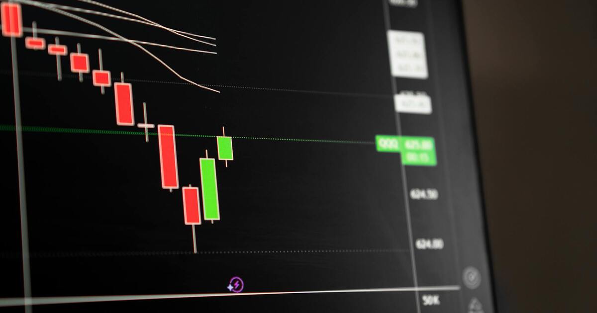
Candlestick Charts
Each "candle" represents one time period and shows four data points:
- Open: price at the start of the period
- Close: price at the end
- High: highest price during the period
- Low: lowest price during the period
Green candles mean the price closed higher than it opened. Red candles mean it closed lower. The "body" shows open-to-close range, and "wicks" show the high and low.
Volume
Volume bars below the price chart show how many shares were traded. Volume confirms price movements:
- Rising price + high volume = strong buying interest (bullish)
- Falling price + high volume = strong selling pressure (bearish)
- Price movement + low volume = weak conviction, may not last
Moving Averages
Moving averages smooth out price data to show trends:
- 50-day moving average: medium-term trend
- 200-day moving average: long-term trend
When price is above the moving average, trend is generally up. A "golden cross" (50 MA crossing above 200 MA) is bullish; a "death cross" is bearish.
Support and Resistance
- Support levels are like a floor — the price bounces up from them
- Resistance levels are like a ceiling — the price pulls back from them
- When a stock breaks through resistance, it often becomes new support
Key Patterns for Beginners
- Double bottom: price drops, bounces, drops to same level, bounces again — bullish reversal
- Head and shoulders: three peaks with the middle highest — bearish reversal
- Cup and handle: U-shaped recovery followed by a small pullback — bullish continuation
What Charts Can't Tell You
Charts show price history, not the future. They don't tell you about a company's fundamentals — earnings, revenue, debt, or competitive position. Use charts alongside fundamental analysis, not as a replacement.
Practical Tips
- Start with weekly or monthly charts for the big picture before zooming in
- Use free tools on Yahoo Finance, Google Finance, or TradingView
- Don't make decisions based on a single indicator
- Focus on long-term trends if you're a long-term investor